Murnau-Stiftung Branding
With its very own touch
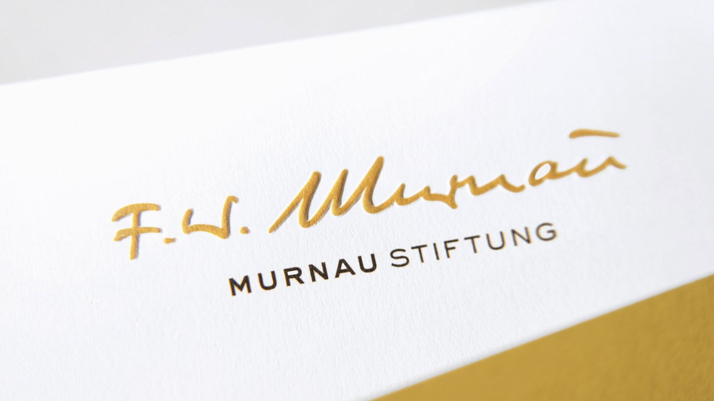
Nothing is more personal than the handwriting. In this case, that of the director whose name the foundation bears. We have reconstructed Friedrich Wilhelm Murnau's signature from historical documents. The logo typography refers to his creative period, the 1920s. The color scheme of broken orange and gray tones conveys the connection between black-and-white and color film.

The Friedrich-Wilhelm-Murnau-Stiftung is committed to preserving and maintaining Germany's film heritage.
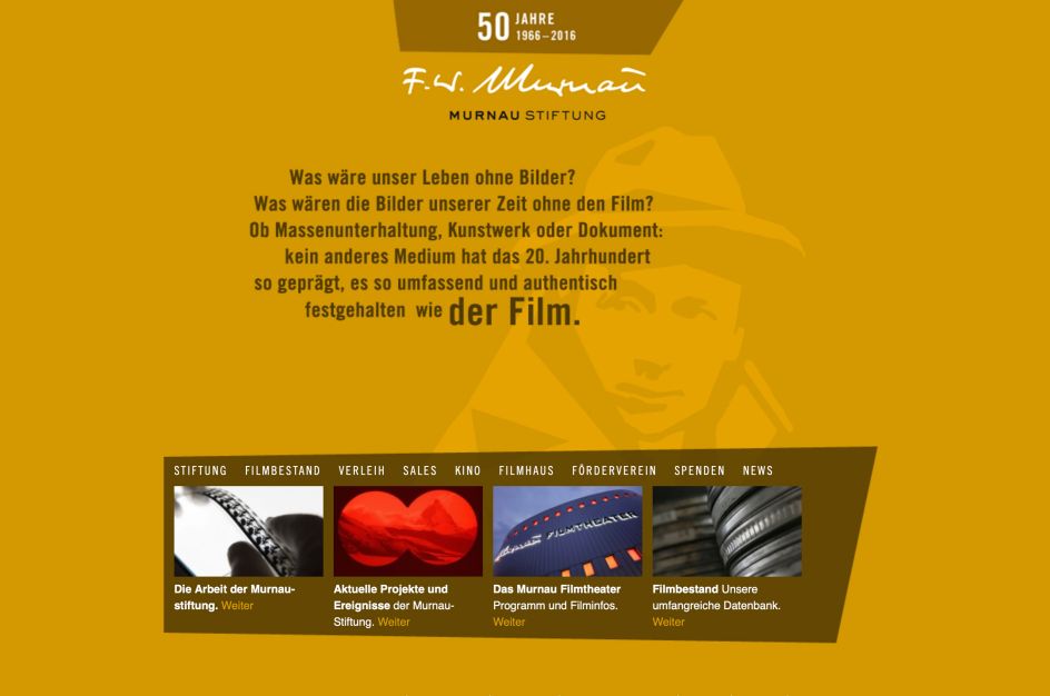
Key visual is an illustrated portrait of Murnau. All these facets contribute to an authentic and distinctive experience of the Murnau Foundation brand.