EVM Branding
Color Energy
The new design of Energieversorgung Mittelrhein (evm) was to be lively and close to people. Eye-catching and yet familiar, so that customers and employees would recognize it. Flexible for all media and yet with a high recognition value.


Our answer: bold colors and exceptional gradients that ensure high recognition in any medium.
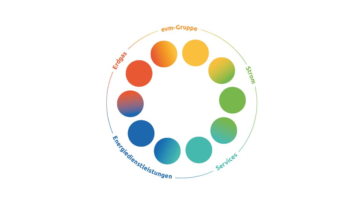
Firmly defined elements that are fluidly related to each other allow a high degree of flexibility within a defined design framework.
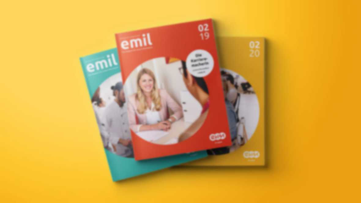
It also sits well on “emil”: The new design gives evm’s employee communication more freshness.
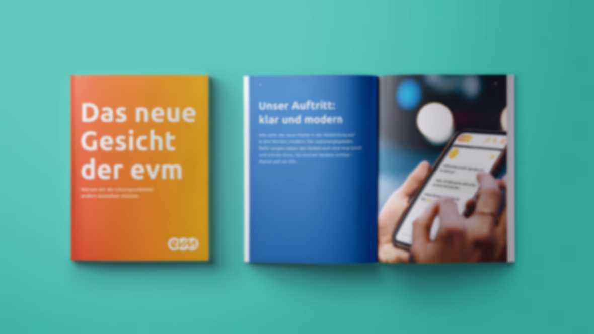
In addition to the website, the employee magazine, and many other touchpoints, the new CSR magazine also sends a clear signal: evm has evolved.